










In CSS, sizing options like width, height, min-width, max-width, min-height, and max-height are used to control the dimensions and scaling of elements, ensuring content appears correctly and responsively across different devices and screen sizes. In this tutorial, we'll cover all the sizing properties and how to use them effectively in web design.
Width property
This property sets a fixed width to an element, defining how wide it should be on the webpage.
Fixed width might not always be the best approach, especially for responsiveness and you should avoid using it in most cases. It's generally advisable to avoid using fixed widths in most cases. Instead, using the max-width property is recommended for better adaptability across different screen sizes.
Why avoid fixed width
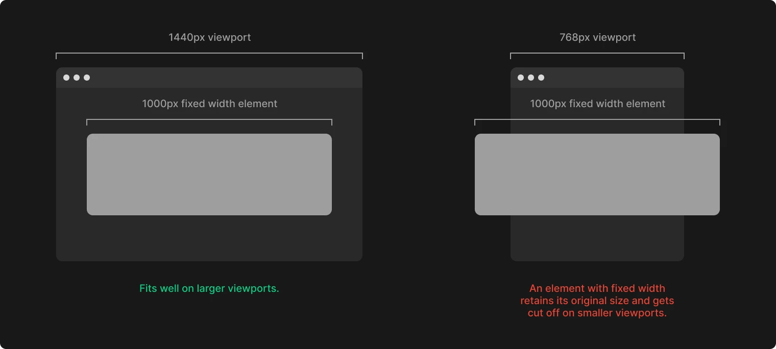
Setting a fixed width (like 1000 pixels) and centering the div works well on desktop. However, it creates issues on smaller viewports where the content exceeds the boundaries, demanding manual adjustments for each breakpoint.
When to use fixed properties
In certain cases, like when creating icons that need to maintain a consistent size of 30x30px, setting a fixed width and height is essential to ensure they appear uniform across all viewports. Similarly, in situations such as forming a perfect square or circle, fixed dimensions are required. For instance, assigning equal width and height values creates a square, which can then be transformed into a circle using a 50% border-radius.
Max width
Max-width sets the maximum width an element can expand to, preventing it from becoming too large and disrupting the layout.
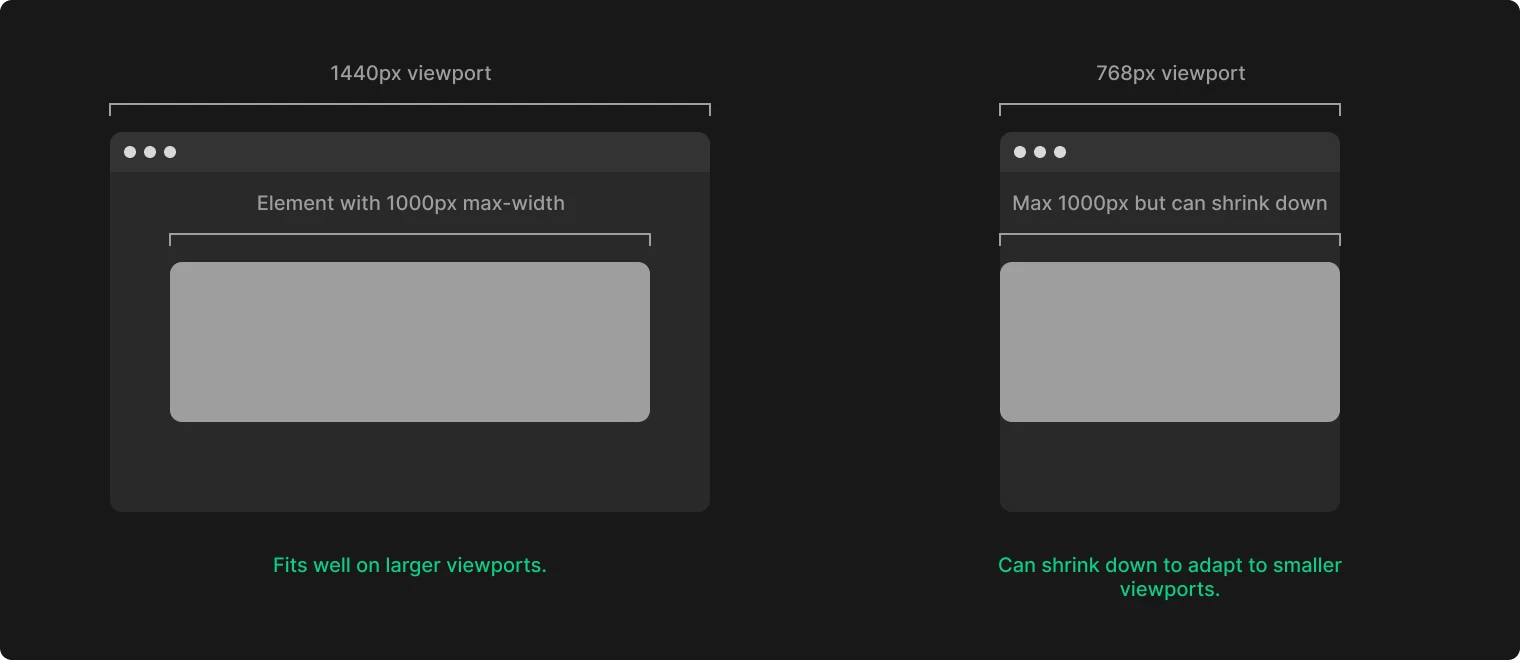
By setting max-width and width to 100%, we establish a boundary that allows the div to scale down on smaller viewports, maintaining the content within the screen boundaries and enhancing responsiveness.
Min width
Min-width works oppositely to max-width, setting the smallest size the element can shrink to, ensuring it doesn't get too small on different devices or screen sizes.
Height property | When it's necessary
For height, we generally let elements determine their height based on content.
However, fixed height settings might be necessary in certain scenarios. Unlike width, fixed height doesn’t usually affect responsiveness negatively, as elements can still shrink in width.